
The challenge
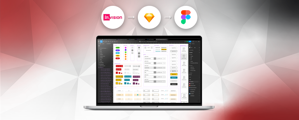
Fragmented design patterns, inconsistent documentation and legacy Sketch and InVision DSM practices were making it increasingly difficult for my team to maintain a consistent, accessible customer experience across the Assisted Channel’s CRM.
The challenge wasn’t simply to migrate a toolkit from Sketch to Figma.
Scaling adoption and measuring impact
To make SEEDS sustainable, I established a dedicated team of five UX Designers to support the Assisted Channel’s primary design toolkit. This created clear ownership for the system while giving designers a shared space to contribute, challenge and improve patterns based on real product needs.
Accessibility became part of the design system
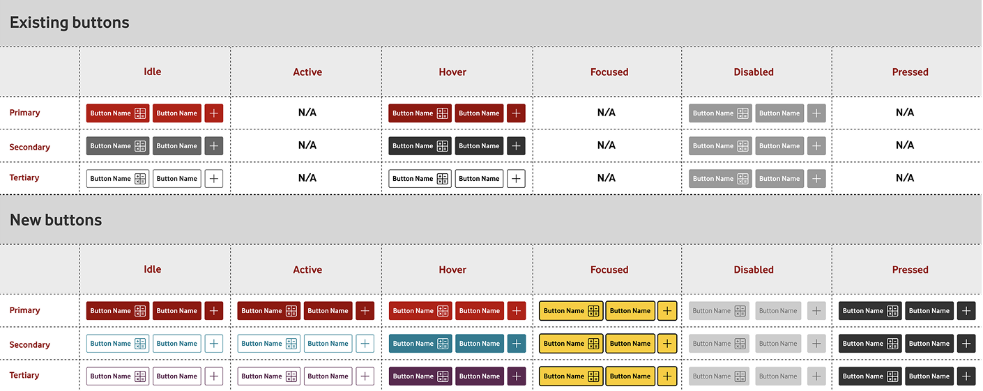
An accessibility audit identified inconsistencies in button states, where active and inactive states could appear too similar. Rather than treating this as a visual design issue alone, I worked with the team to validate the problem through user research.
Testing with visually impaired users showed that the lack of sufficient distinction could create uncertainty when interacting with the interface.
This insight influenced both the component design and the standards behind it—strengthening visual differentiation, interaction states and accessibility guidance across the system.
The lesson was clear: accessibility needed to be designed into the foundation, not added as a compliance check at the end.
From reusable components to a scalable framework
We established a component framework designed around three principles:
Reusable
Components could be applied consistently across journeys and products, reducing duplicated design effort and creating a shared visual and interaction language.
Adaptable
Components were designed to accommodate complex product scenarios without teams creating inconsistent variants. Boolean variables provided flexibility while maintaining core design standards.
Easy to implement
Clear usage guidance, variants and implementation patterns gave designers and engineers a common reference point, improving the transition from design to development.
Where suitable components already existed within the CRM platform, I influenced stakeholders and delivery teams to adopt them rather than recreate them. This helped connect the design system to the technology already being used in production.
Governance by design
SEEDS became more than a Figma library. Its relationship with SSTRUTH governance helped connect design quality, accessibility and implementation standards to the wider delivery process.
Through workshops, design reviews and cross-functional collaboration, we established clearer expectations for how components were selected, adapted, reviewed and handed over to engineering.
I challenged designers to explore complex scenarios rather than defaulting to one-size-fits-all patterns, while using peer review and shared standards to create greater consistency across the team.

Measuring the impact
The framework reduced unnecessary design iteration and rework while giving teams a more efficient starting point for new journeys.
Approximately 50% improvement in workflow efficiency
By creating reusable components, clearer standards and a more accessible design foundation, we reduced duplicated effort and enabled designers to move from exploration to delivery more quickly.
The wider value was organisational: a fragmented toolkit became a shared design capability that could scale across squads while maintaining quality, accessibility and governance.
What I learned
The biggest lesson was that a design system is not simply a library of components. It is a way of working.
The most effective systems emerge when designers, researchers, engineers and stakeholders contribute to the framework, test it against real customer needs and continuously challenge how it can work better.